Tofi
Acronym of Take-Out Food Idea
Various tastes,
a way of life
Acronym of Take-Out Food Idea
Various tastes,
a way of life
A website that collects and publishes Lunchbox recipes.
Categories: Logo Design, Web design and development
The goal of this website is to involve users to share and discover a variety of cooking ideas for everyone's taste and improve anyone's cooking skills.
Mission
The aim of this project was to create a Food’s blog and Recipe sharing platform with WordPress.
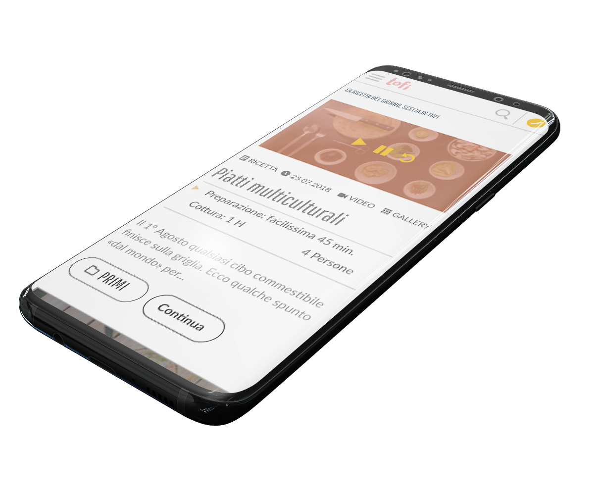
TOFI, which stands for Take Out Food Idea, is a website for finding new recipes for lunch packs and for sharing new ideas.
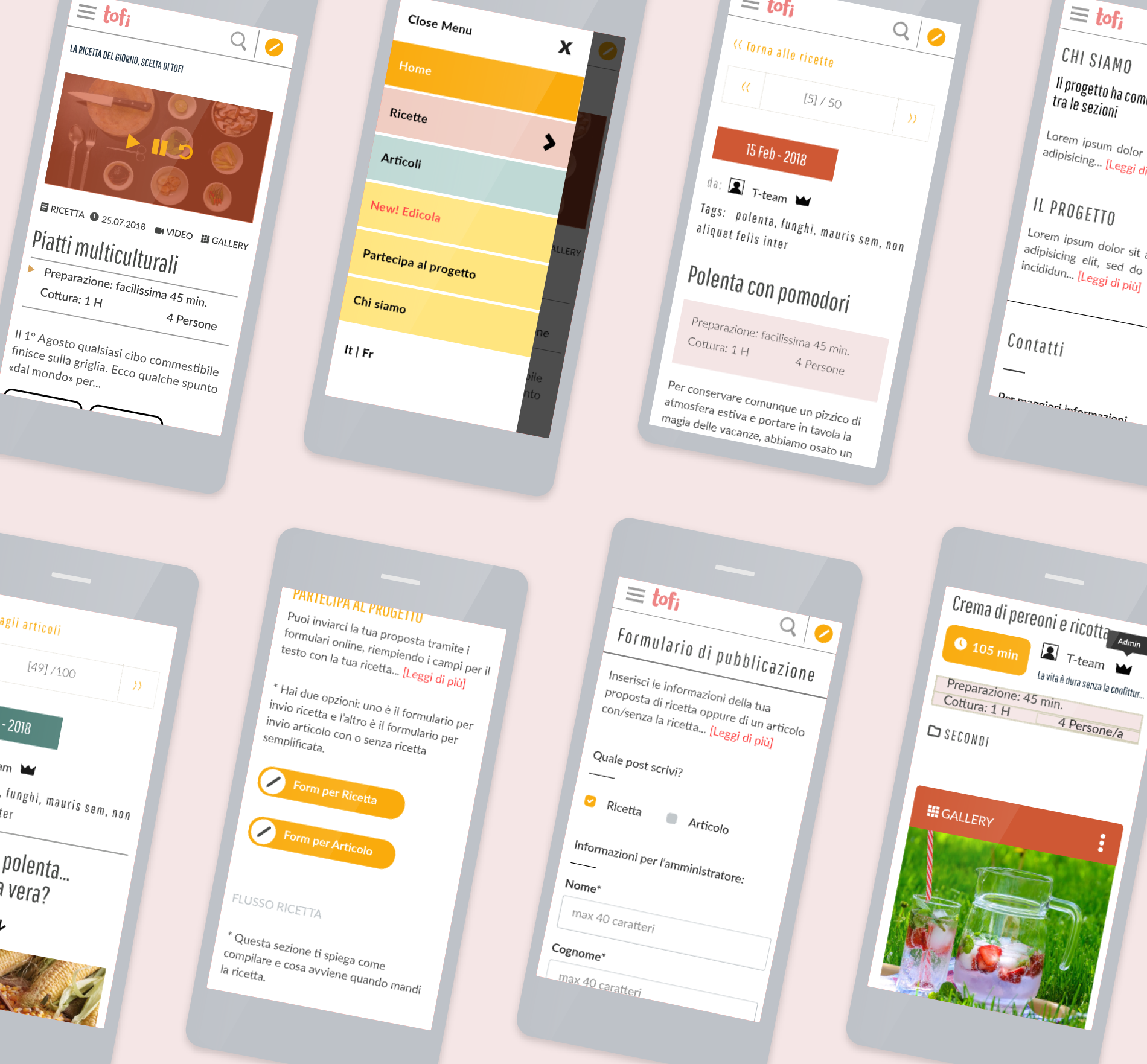
Its features include a smooth distribution of information related to food, encompassing a wide range of actions: recipes look-up, videos, photo galleries, article publication, information request and recipe forwarding to be published on site.
With its 11 fully responsive pages, it is therefore a multiuse blogging scheme and dynamic website.
Vision
A website that collects and publishes recipes for meals to take out from home.
User needs and goals
A satisfying user experience thanks to a self-explanatory User-Interface.
School project
Individual project
January 2018
Corporate identity, UX & UI design, Web design and development
Twelve columns, center, bootstrap grid breakpoints, my own WordPress theme
None
Discovery
Concept development
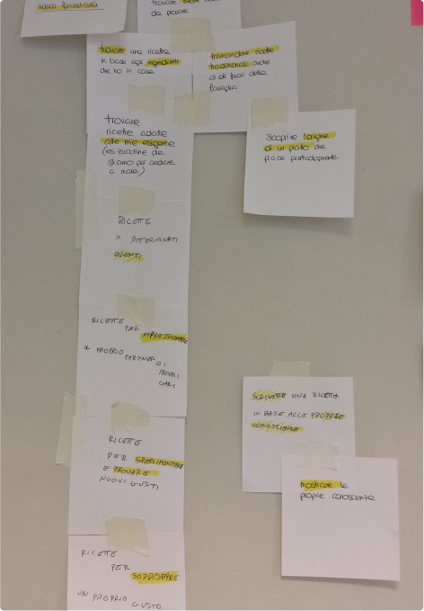
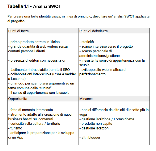
To develop a coherent product, still in the definition phase, the following methodologies that are used in product design were adopted. I did a lot of research and analyzed the platform via Brainstorming, Target, SWOT, comparison with competitors and similar websites, comparing the work of others in the design of the interface and the user experience.
User research
Choice of value: Even before the product comes into existance, the marketing strategy focuses on the market segmentation, the selection of the target (in this case students) and the organization of how and where to launch the new product (positioning of the offer).
See below beginning from the left: brainstorming, user research and SWOT analysis.
Functional analysis
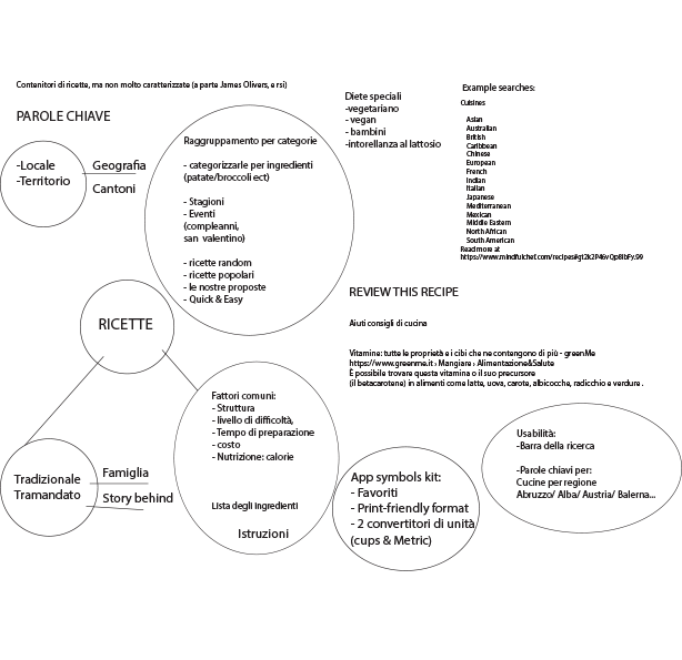
Core elements of the niche
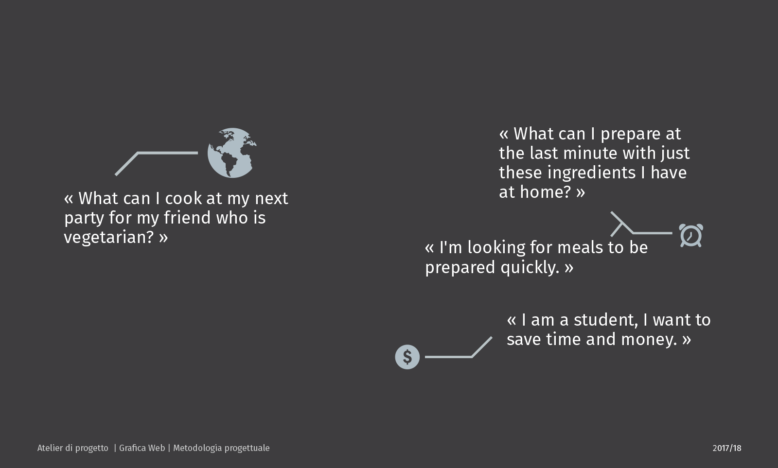
Finding possible user's needs
Aside from students, even in the world of work, a niche of people can be found, which brings their lunch packs to consume at work and enjoys the services of recipes online. This could be a further target group for the success of the website.
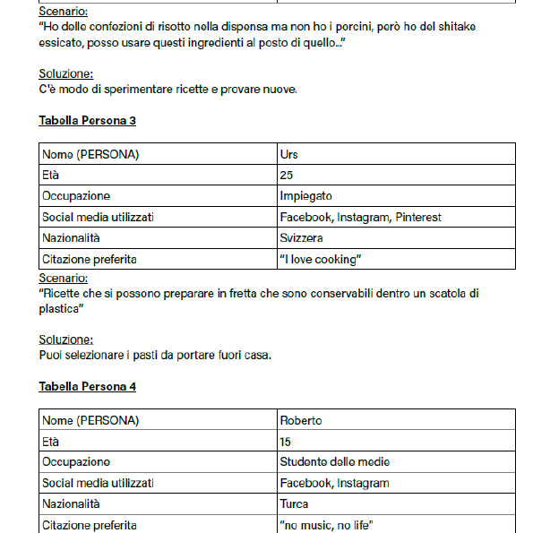
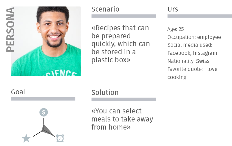
Personas
Finding the opportunities
I produced the so-called personas, the identification of faces, profiles, groups on potential visitors and their needs.
Defining users' goals
Primary problem: "Go and try to find recipes to prepare in a short time and at the same time be able to take them away from home."
I made choices on which specific areas it is worth to deepen the product.
Concept
Tofi is an acronym for “Take Out Food Idea”. In the working and student world, especially in the big cities, the need for home food consumed in the workplace has arised. These services are currently offered by the kiosks at train stations.
This website aims at satisfying the need to take food to school or to work, by choosing simple ingredients yet composing healthy and appetizing meals. It is not based on traditional cookbook recipes alone.
While one goal is to find the website, one risk is that the user will not stay on it. Applying straightforward visual design attracts newcomers to actually use the platform and not just seeing it. Easy accessibility is one main point for advertising. Furthermore, advertisement based on a peer distribution through word of mouth is often the most effective one. Therefore placing banners on school sites or social network platforms such as Facebook, Twitter, etc. will spread the news in a fast and cost-effective manner.
Identity Design
Thematic Line
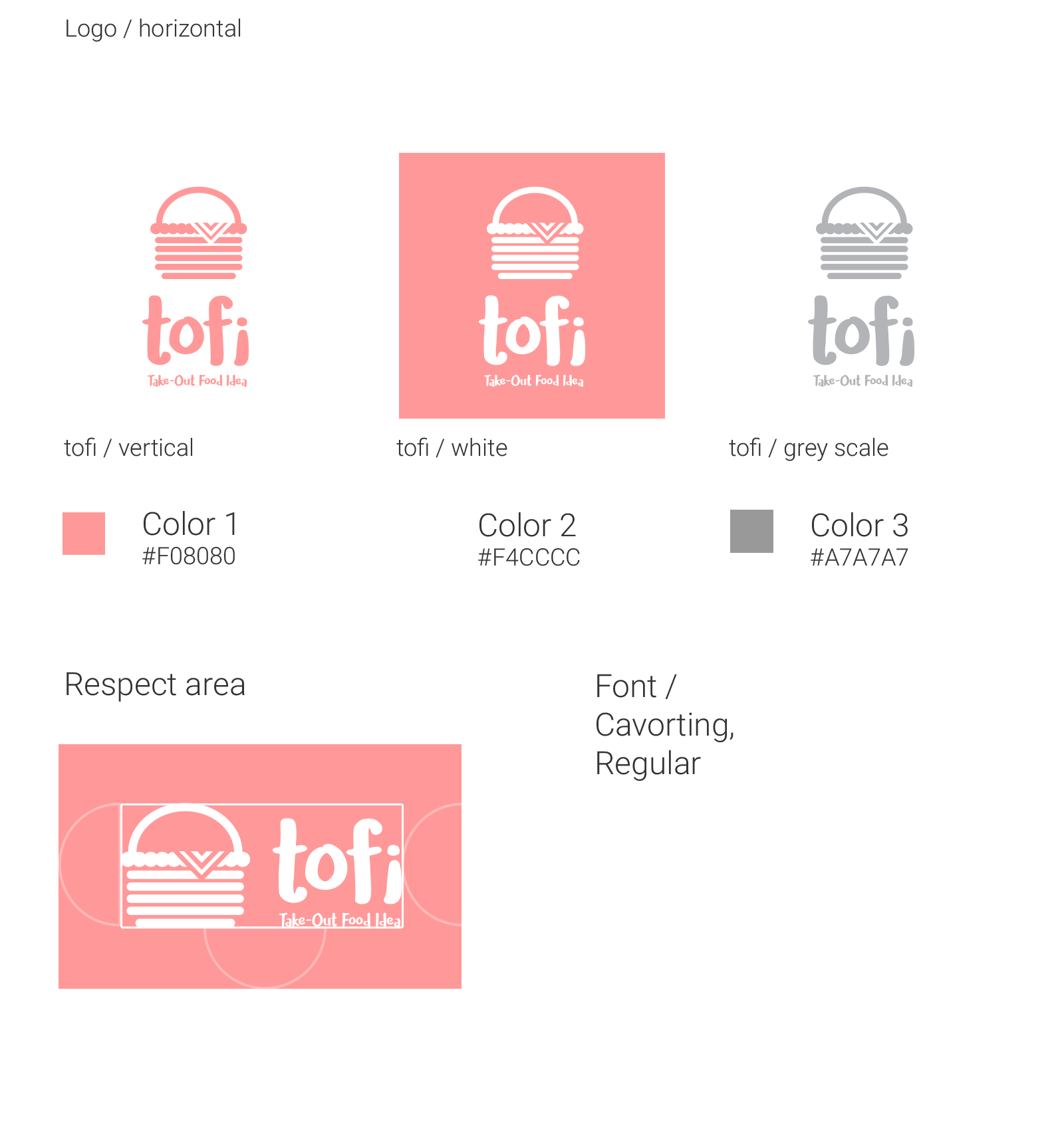
To create a logo, I was inspired by the theme and reflected on what message to summarize in a single image, the visual identity.
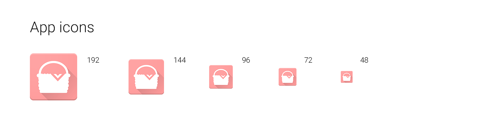
What I came up with was a wicker basket, which represents the basic concept of carrying food and recalls a picnic.
App icons were also designed and planned for future smartphone application development.

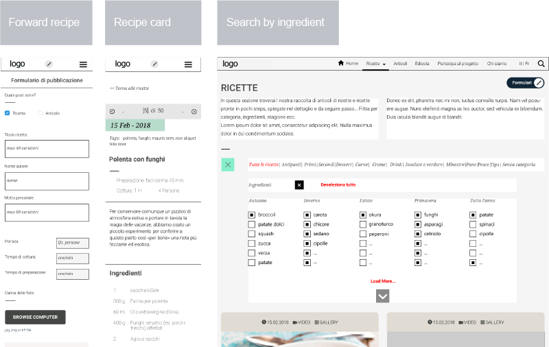
Wireframing
These are some examples of wireframes, an initial process of designing the structure of contents, the skeleton of the site. A further revision is then carried out in future instances. The next step taken is then to design the graphics, typically from mid- to high-fidelity prototype of the final product.
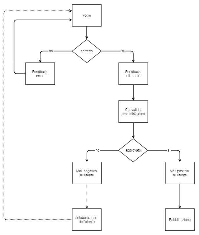
Logic Flow
This diagram describes the process of forwarding a message from a user.
Visual identity
The visual identity represents the design style, including the logo and the colours chosen to identify this fictive service.
These are the predispositions of the site and the elements that I considered in the accompaniment of work.
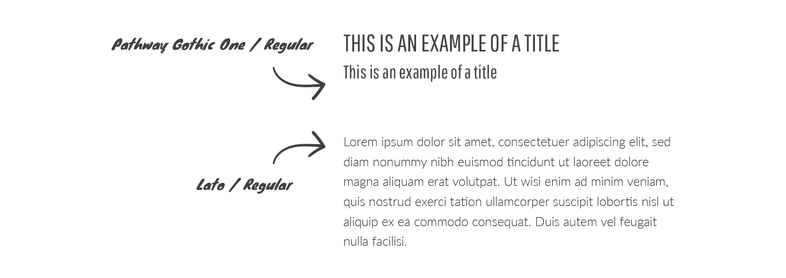
Choosing the right font and color-matching are essential for the success of the website.
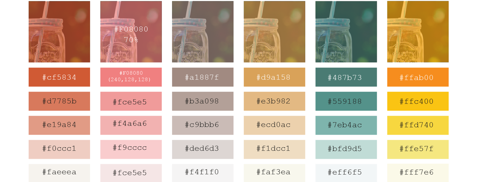
I chose the main color as pink, to recall a cheerful picnic, the red to be attributed to the thematic of the recipes for them to stand out, while green was appointed to the articles. Orange was also used as the accent color.
Color pallet
Fonts
Pathway Gothic is a narrow font that looks great either in uppercase and lowercase. Perfect for publishing large text with the need to save space.
Final Design
High Mockup Website Proposal - Mockup is already a document with main elements, format, structure with all measures with precise calculations, as very similar in code.
#1 Shiny smartphone mockup Free PSD created by zlatko_plamenov / Freepik.
#2 Macbook and an iPhone for showcasing Free PSD designed by Mark Conlan.
#3 Earth globe Free Icon made by Freepik from www.flaticon.com